A Valorant Map Built in Four Weeks
This map was created during a level design jam hosted by The Design Den on Discord. The challenge: make a playable Valorant-inspired map in four weeks, blockout only — no props, materials, or textures beyond dev textures.
With no engine requirement, I chose CS:GO via the Hammer Editor to best approximate Valorant's gameplay style. This let me test and iterate based on a closely matching tactical shooter experience.
Top-Down Overview
A Map Within a Map
Most elite maps in this genre feature a dedicated middle to facilitate rotations from bomb site to bomb site. I wanted to design a conflict zone that players could play around as if it were its own smaller map — one that also allowed either team to rotate between sites in a variety of ways.
Mid on Faith has two distinct layers, each serving a different purpose for the player.
Rotation Layer
Top mid is open and intentionally exposed — designed primarily for rotations. The openness actively discourages players from holding it as a position; it's a thoroughfare, not a stronghold. Move through, don't stay.
Conflict Zone
Bottom mid is where the majority of combat is supposed to take place. It's tighter, more contested, and allows both teams to rotate between bomb sites under pressure. This is the heart of the map's moment-to-moment gameplay.
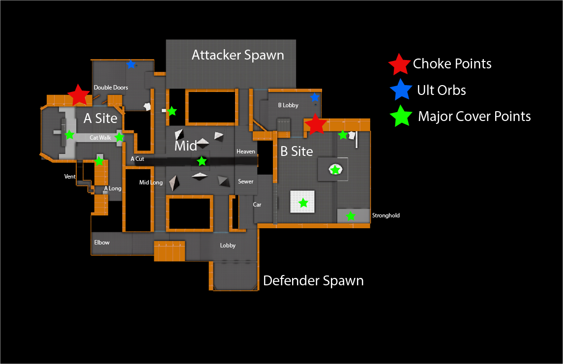
Mid features a giant tilted cross — visible from every point on the map. The upward-tilting arm points toward A site; the downward arm points toward B. Players always know where they are.
Sketches & Layout

Design the Fight First, Then the Site
This map had two major goals. The first was a dedicated mid. The second was well-designed main choke points into the bomb sites.
I started each bomb site by crafting the main choke point first, then designed the rest of the area around that conflict zone. Maps are not fun if the main conflict zones are not fun.
My goal was to give the attacking team the challenge of taking bomb sites through the choke points, while giving defending teams a clear focal point to hold their turf.
Double Doors
A site's choke point features a set of double doors — a larger entrance made narrower by the door geometry. Defense has a notable advantage here: the pinched entry limits attacker options, and there are three main defensive positions to hold from. The doors may eventually become penetrable with more iteration.
Wide Entry
B site's choke point is wider and deliberately favours the attacking team. The entrance is broader but longer — a different kind of challenge. The defending side has fewer positions to hold from, creating a fundamentally different dynamic to A site and keeping each site feeling distinct.
Annotated Map

Post Mortem
Faith was a focused four-week sprint that forced me to think tactically from the start. Working within the constraints of a jam — blockout only, dev textures only — stripped everything back to pure spatial design decisions.
Using CS:GO and Hammer instead of Valorant's engine was a deliberate choice that paid off. The tactical shooter feel translated well, and iterating inside Hammer gave me tight feedback loops I wouldn't have had otherwise.
The biggest lesson was the importance of designing the fight before designing the space. Starting with the choke point and building the site around it meant the most critical player interaction was always the foundation, never an afterthought.
The tilted cross landmark in mid also reinforced something I want to carry forward: players should always know where they are. Orientation isn't just UX — it's a design value.